ORSKY Medical
A logo and identity system for ORSKY Medical, a clinic built around ultrasound imaging, with plans to grow into a full-service medical facility, delivered as a complete package of marks, colors and type.
- Client
- ORSKY Medical
- Role
- Logo design, brand identity, naming, brand strategy
- Deliverables
- Brandbook, core strategy sheet
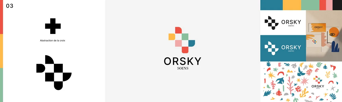
ORSKY Medical is a clinic built around ultrasound, with plans to grow into a full-service medical facility, and its logo has one job before all others: reassure. I took on the naming during our first phase of ideation, and with ORSKY Care and ORSKY Medical both on the table, the mark had to hold both ideas at once, the warmth of care and the authority of medicine, in a form a patient reads in a second, and one the clinic will not outgrow.
Behind the mark is a written strategy. One core sheet sets the position, reassurance first, so the name, tone and lockups all do the same job: make the patient feel safe before anything else.
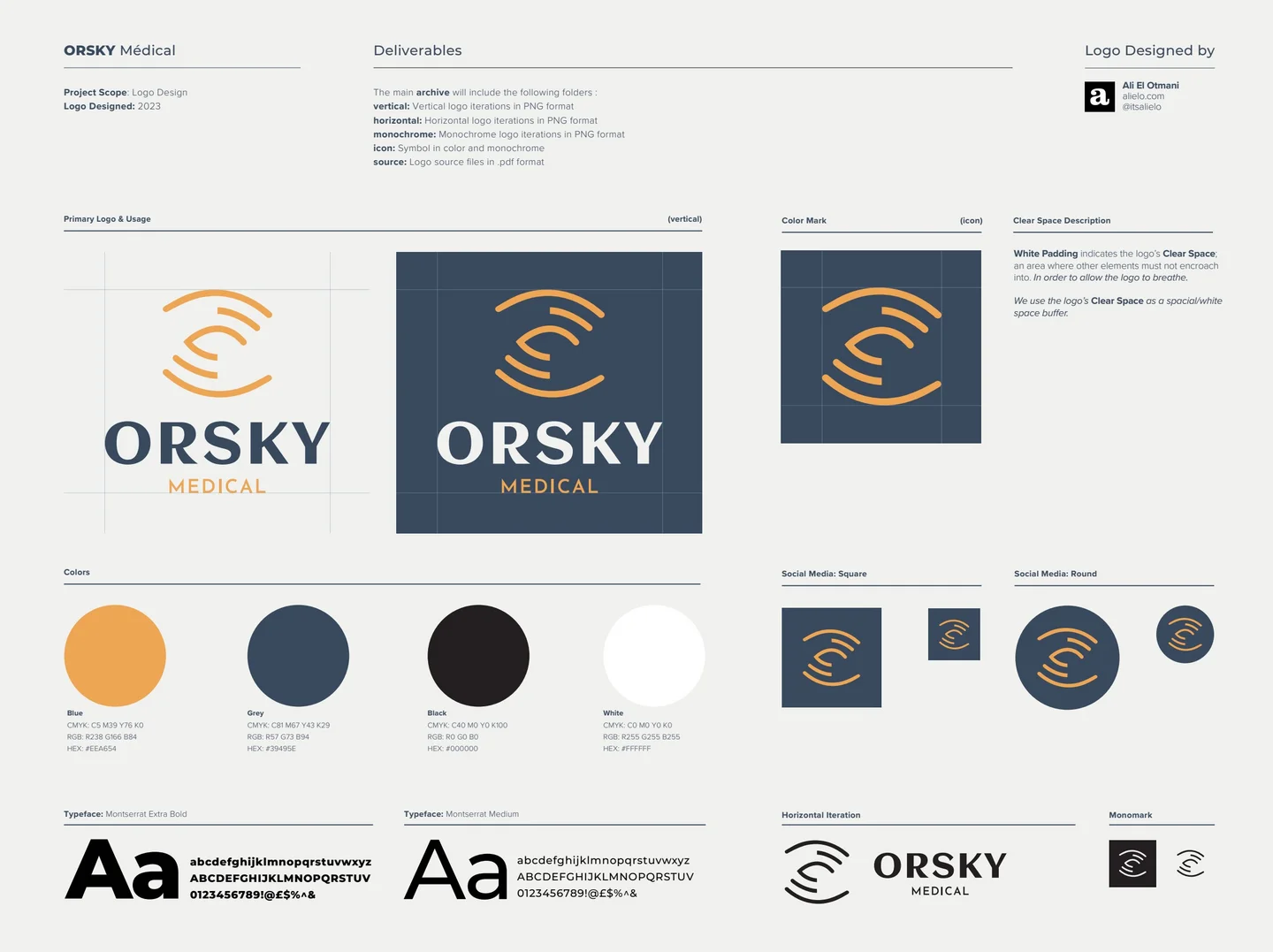
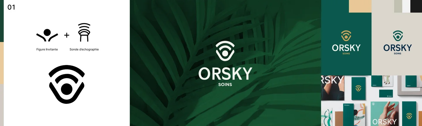
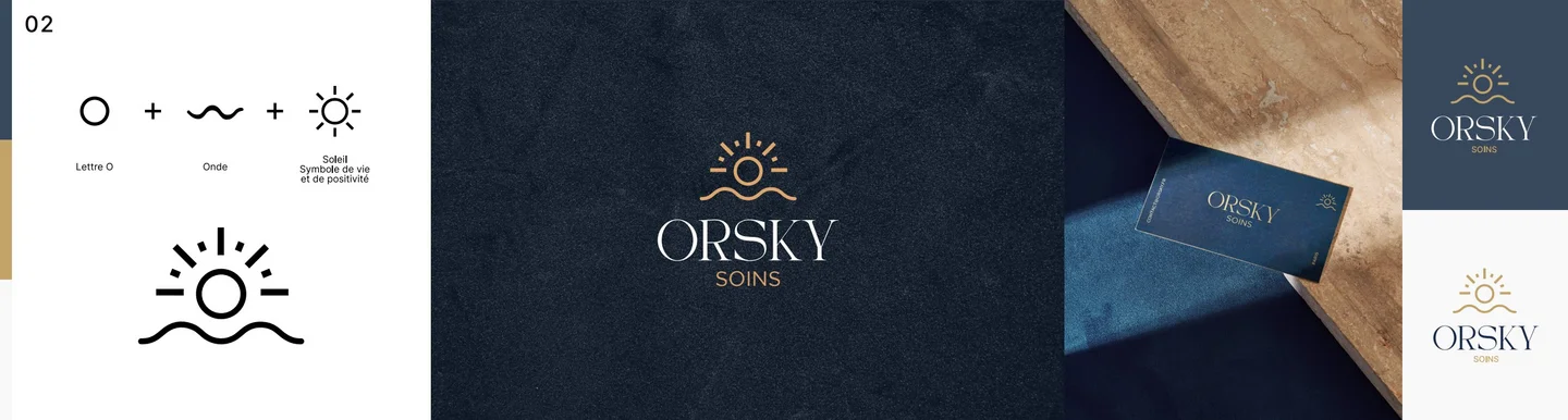
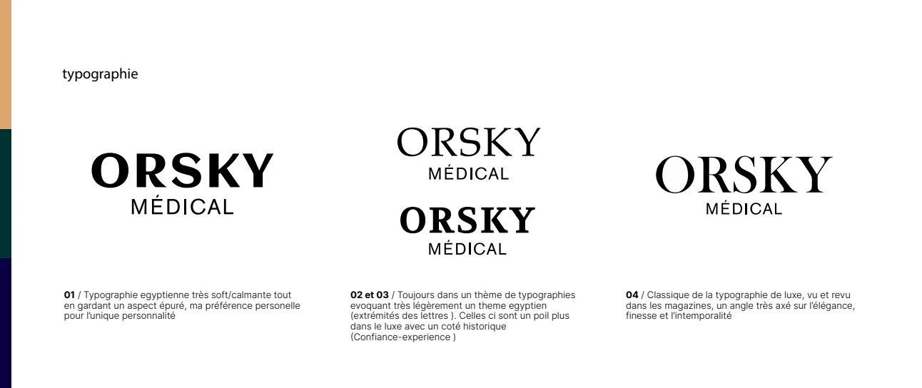
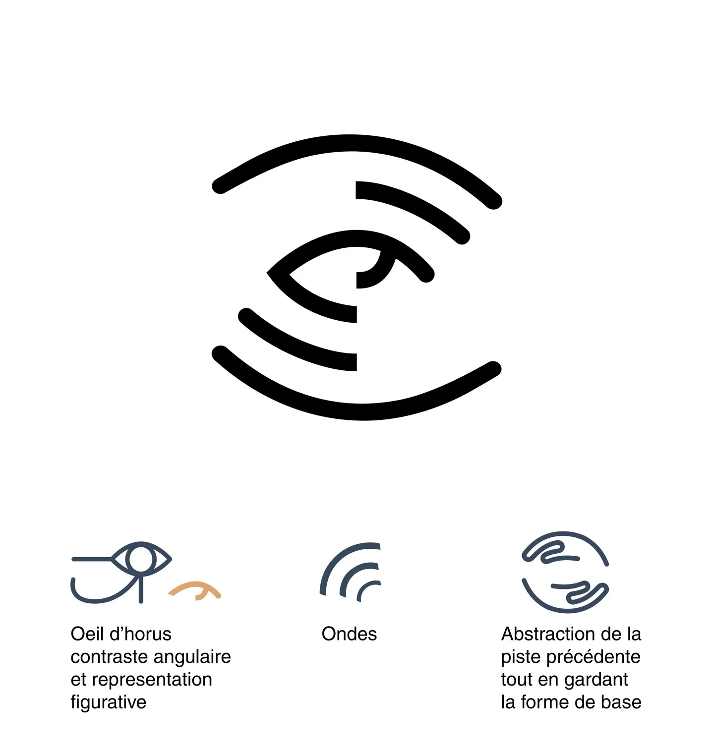
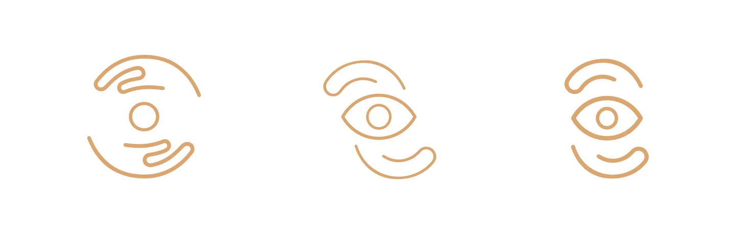
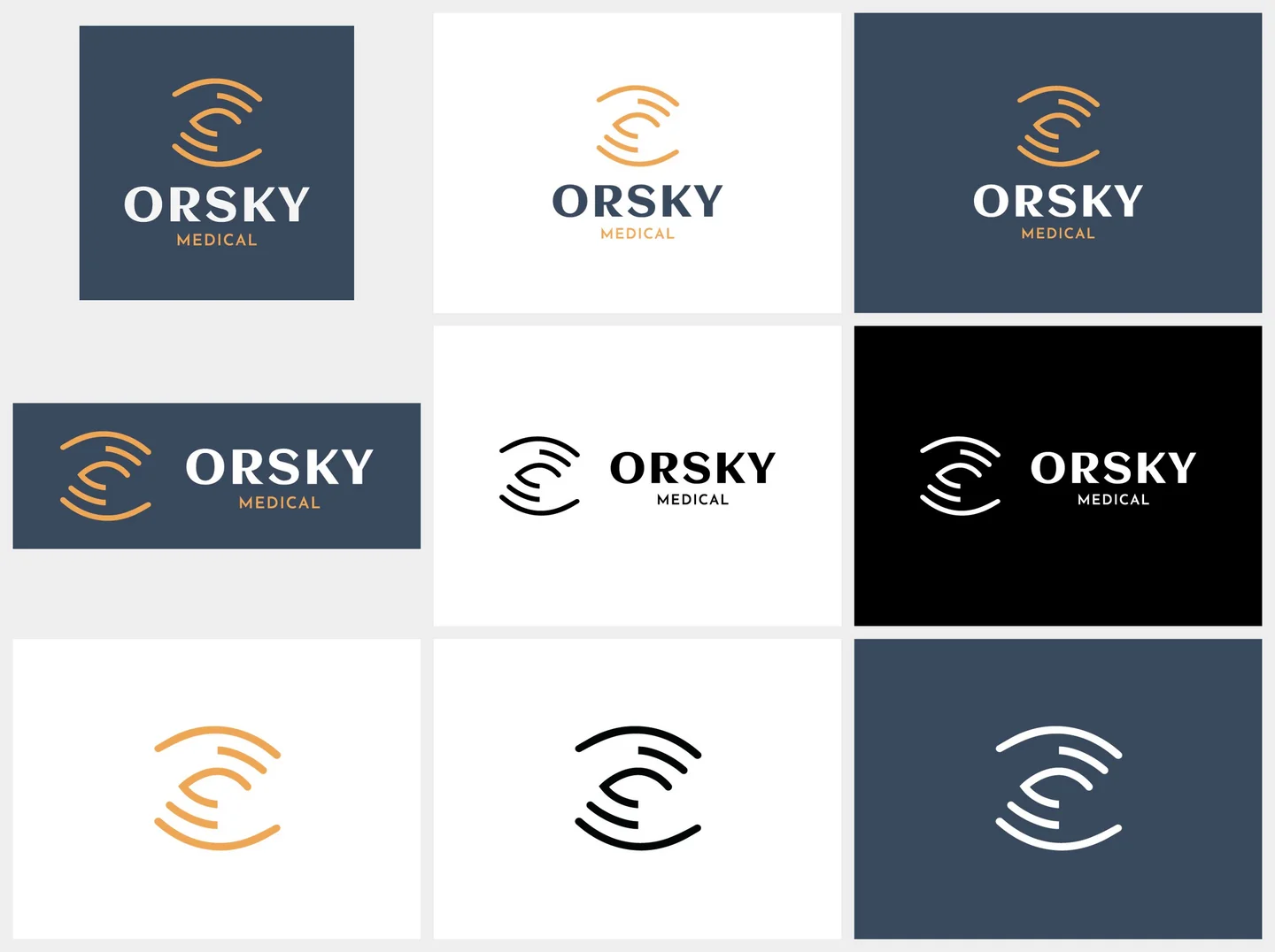
The direction was worked out in the open: three styleboards set the art direction, then typefaces and symbols were tried side by side, pros and cons weighed, before the eye was kept. The mark builds an eye from radiating arcs in gold. Three sources meet in it: the Eye of Horus, a symbol of protection and health, the arcs of an ultrasound wave, the clinic's own signal, and two cupped hands, abstracted until only their gesture remains, one above and one below the eye. Around it sits a complete system: the ORSKY wordmark, a slate blue grey paired with the gold, and lockups for every use, vertical and horizontal, an icon for small sizes and social profiles, and monochrome versions for print and engraving.
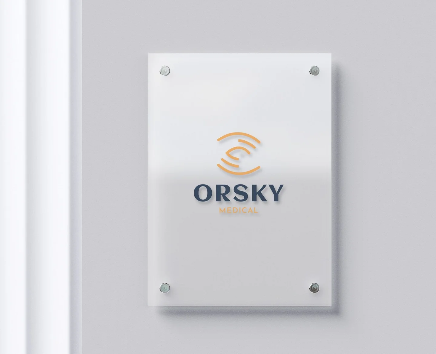
The clinic received the identity as a finished package: every lockup exported in color, inverted, white and monochrome, the vector sources, the font family, and a quick-glance sheet for the clinic's personnel, setting out the clear space, the colors and the type. One sign carries it at the clinic entrance, the gold eye on frosted glass.