Corda Health
Brand identity and product UI/UX for Corda Health, a platform that follows surgical patients through the 90 days recovery protocol at home.
- Client
- Corda Health
- Role
- Art direction, identity and UI/UX design
- Deliverables
- Logo suite, icon set, branding strategy guidelines, photography direction, website, mobile app UI
- Scale
- One identity across a 33 page brand book, an 80 file production package, and a website and console in desktop and mobile forms
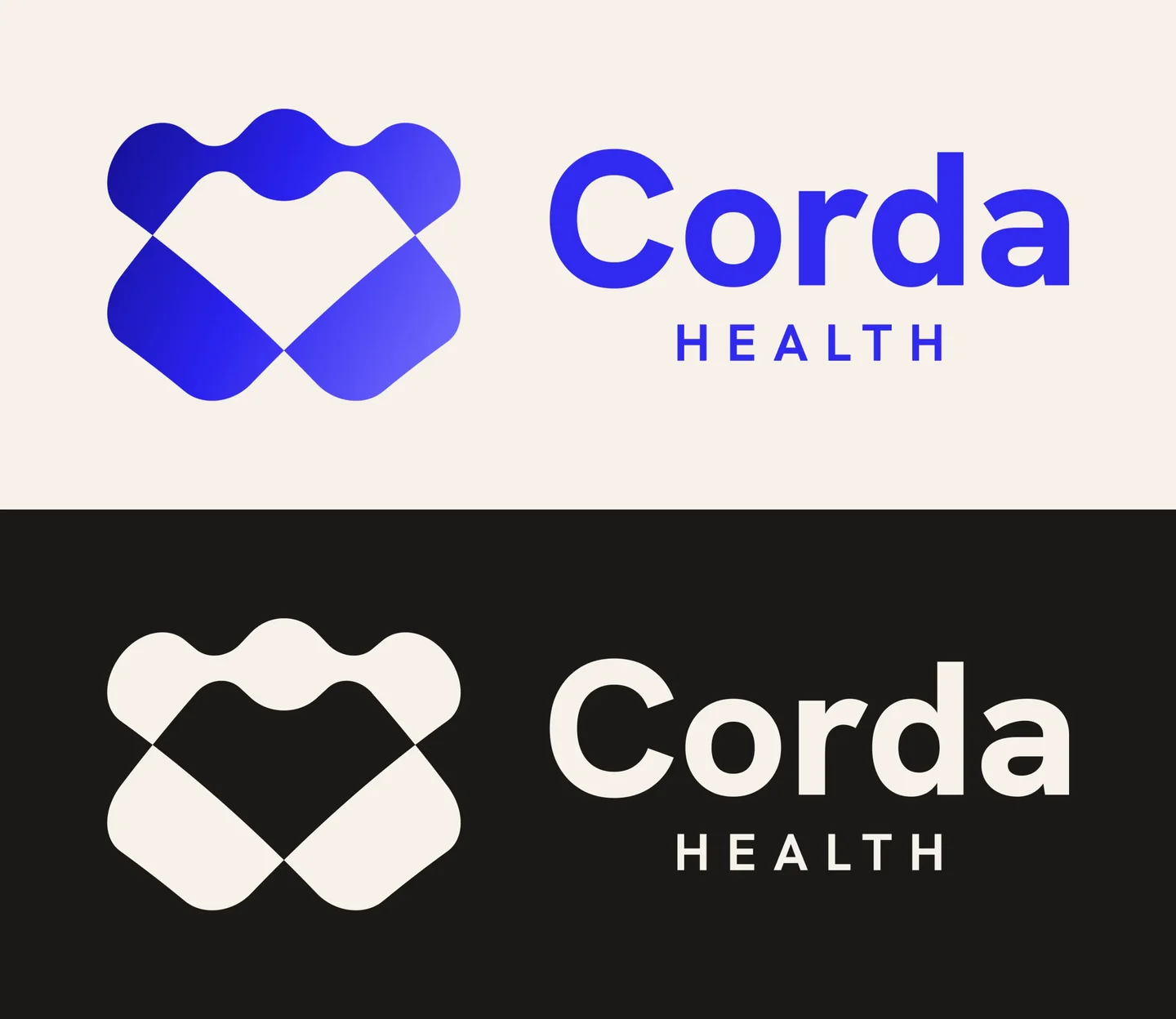
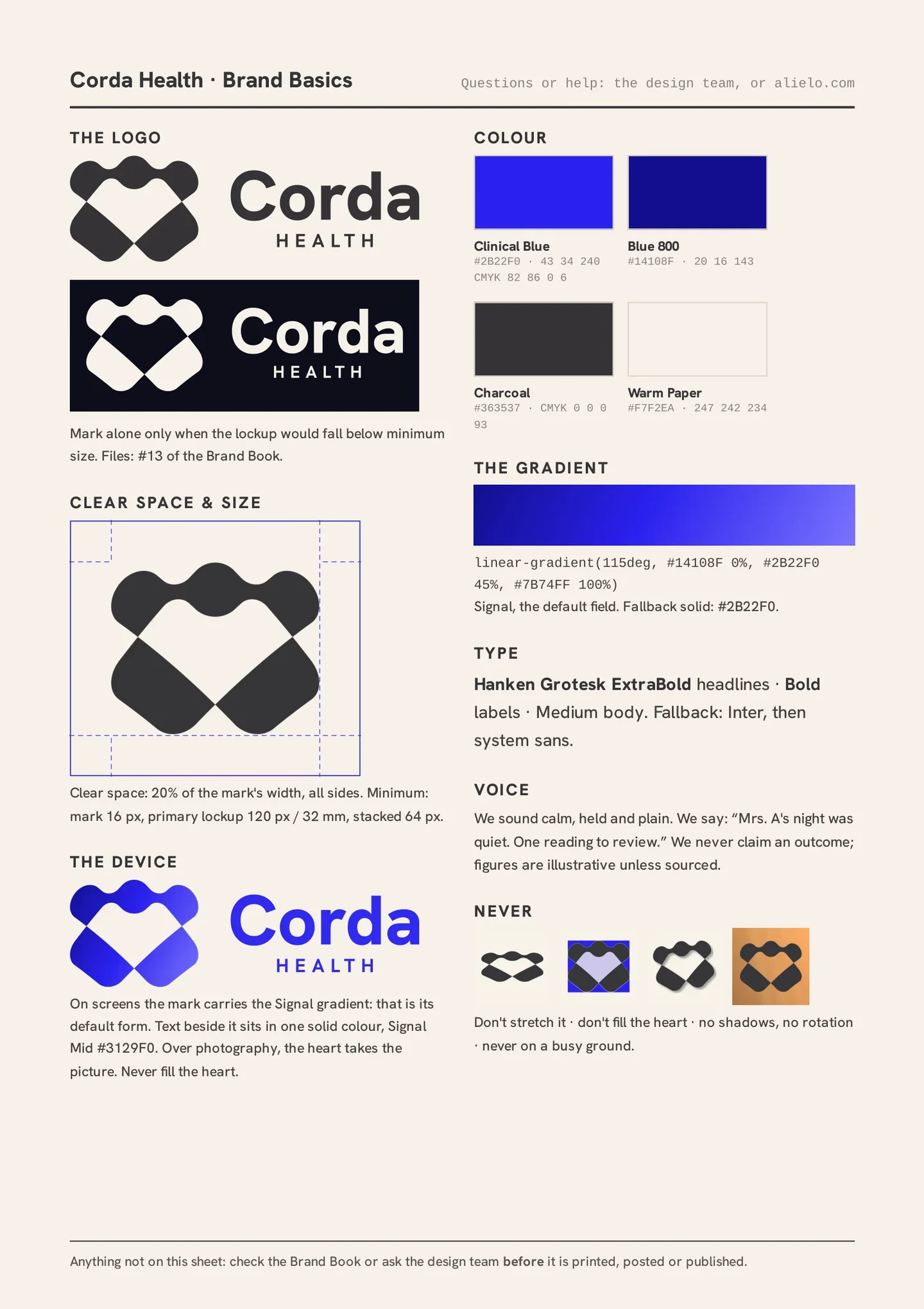
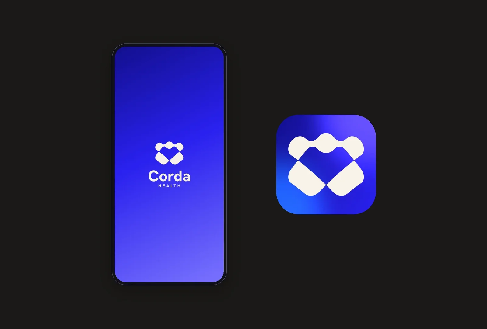
The mark is built from two shapes: a waved band across the top, and two broad bars that cross beneath it. The heart at the centre is not drawn. It is the space the shapes leave between them, so on any ground the heart takes the ground's own colour: paper, photograph or screen.
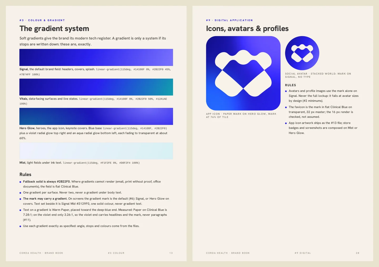
On screens the mark carries the Signal gradient, its default form. In print it holds as one flat colour: charcoal, Clinical Blue or paper white. It stays legible at 16 pixels, the size of a browser tab icon.
The wordmark is set in Hanken Grotesk ExtraBold, with HEALTH centred beneath it and tracked wide. The lockups are fixed artwork, never reset: primary, stacked and mark only, issued in vector and raster forms.
A surgical ward discharges a patient and, for the next 90 days, largely loses sight of them. Recovery happens at home: blood pressure, oxygen, wound checks, pain. Corda Health closes that gap: patients follow a guided protocol on their phones while the ward watches the readings land, stepping in only when its own escalation rules say so.
I was commissioned to cover the company end to end: a logo and identity system, and the product it belongs to, designed as one piece of work.
Around the mark, I built the full specification: Clinical Blue with a family of soft gradients whose stops are written down, Hanken Grotesk as the single typeface, an icon set drawn on the mark's geometry, a voice that stays calm and plain, and photography rules that keep care at home in warm light, never in a corridor. I set everything out in a 33 page brand book with a one-page sheet, and issued it as production files: vector logos, design tokens, fonts and the app icon.
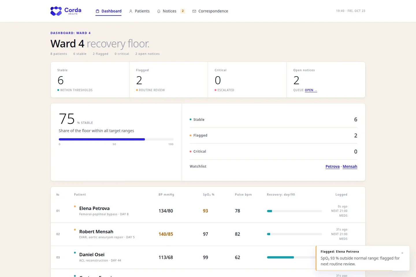
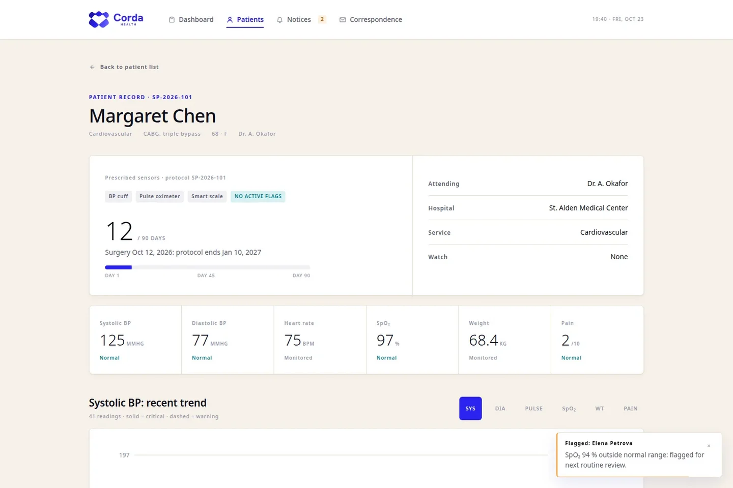
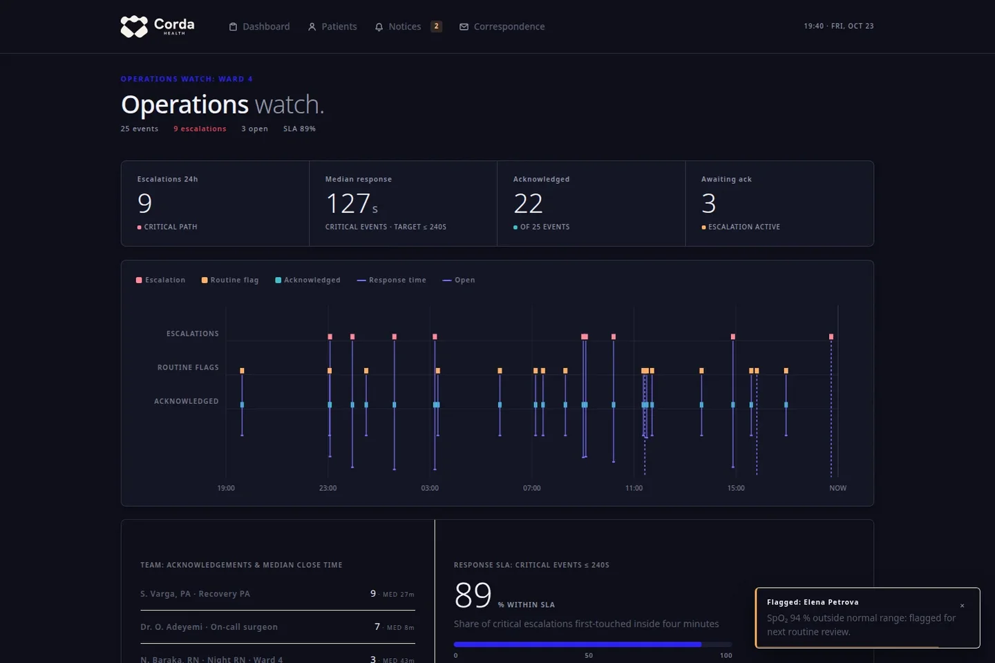
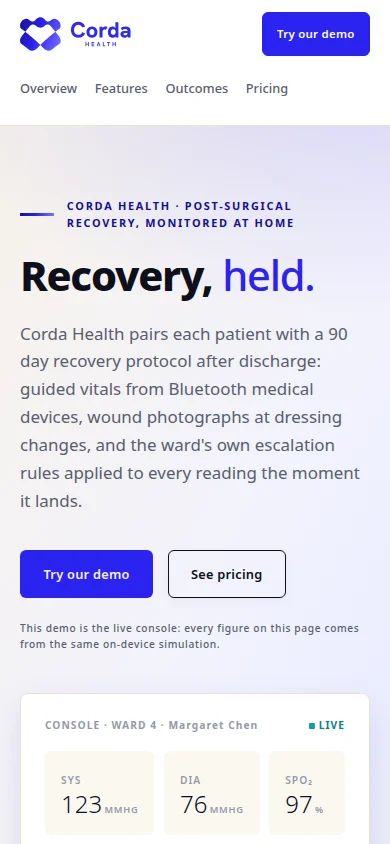
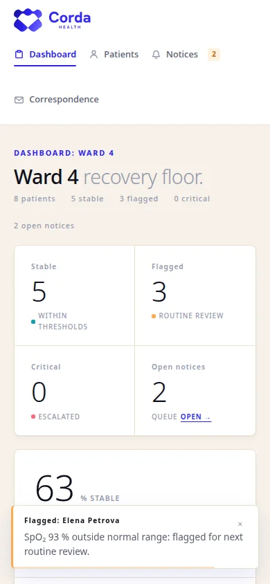
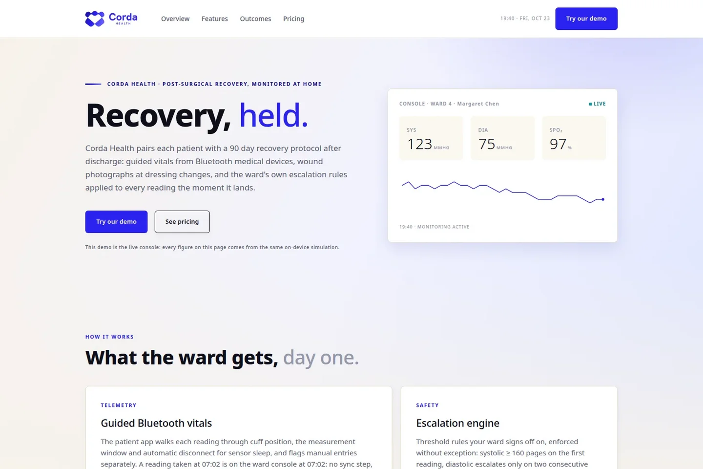
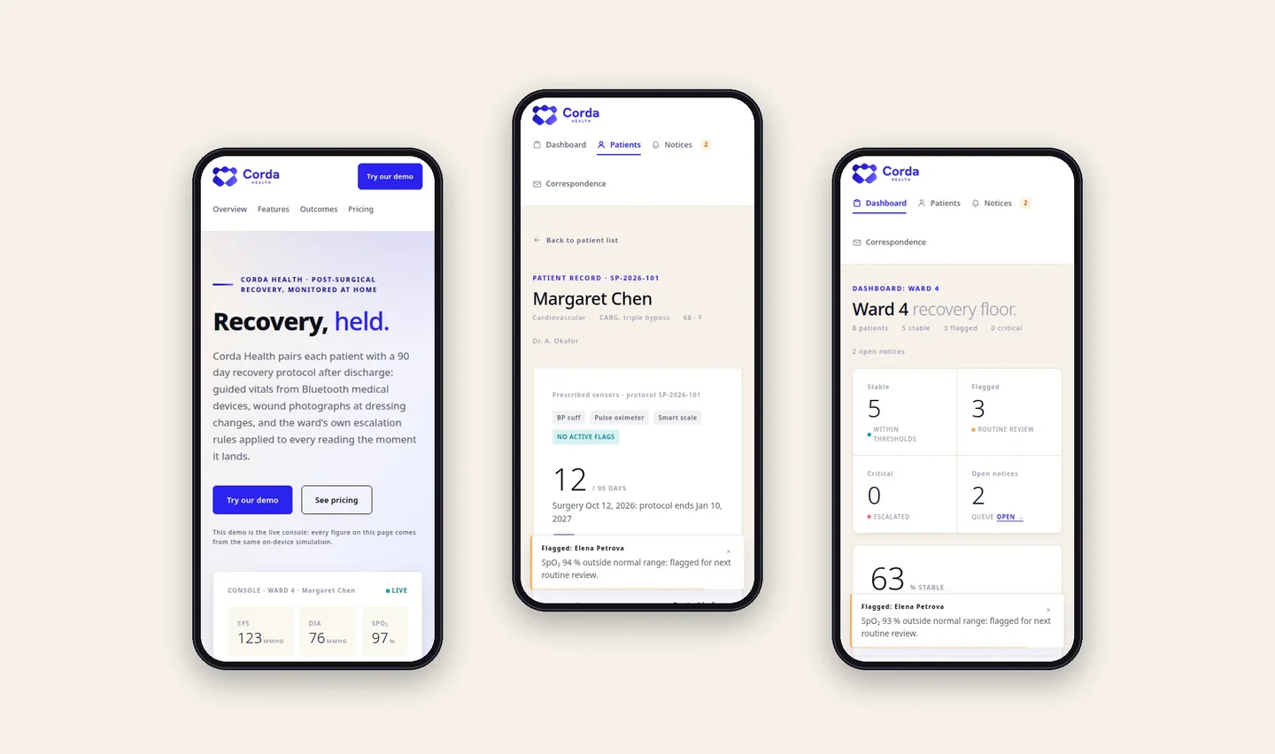
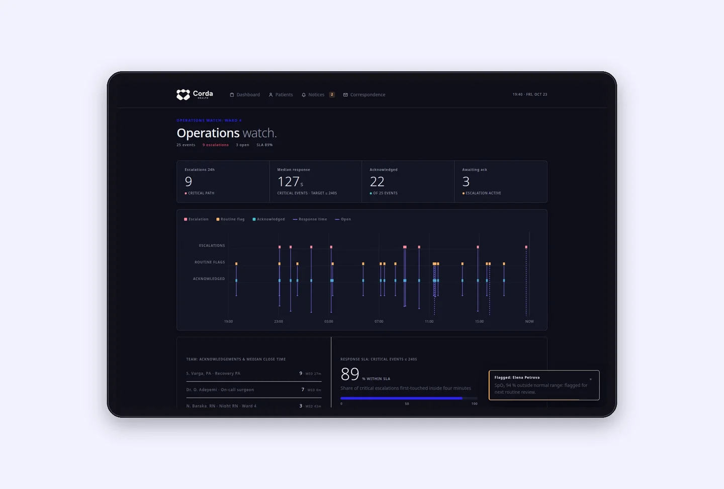
The same language runs the product. The website I designed introduces the service and carries a live demonstration of the console. The console gives the ward a dashboard of every patient in recovery, a record for each one with their protocol and readings, and an operations watch that tracks escalations against the response times the ward promises. It runs in two themes, light for the ward and dark for the night watch, and every screen holds on a phone.
What I delivered is not a logo on a deck. It is one identity, held the same way in the brand book, on the website and inside the product, issued as production files and ready for whoever joins the company next.