Overview
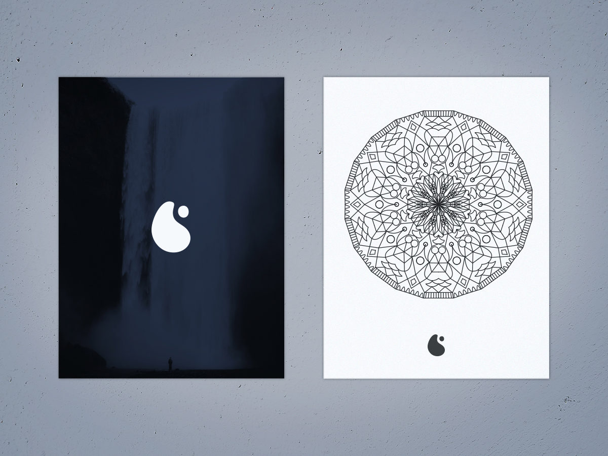
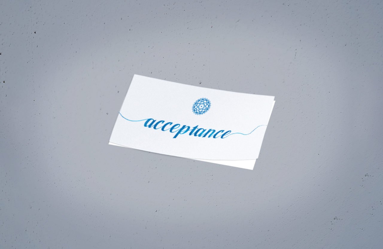
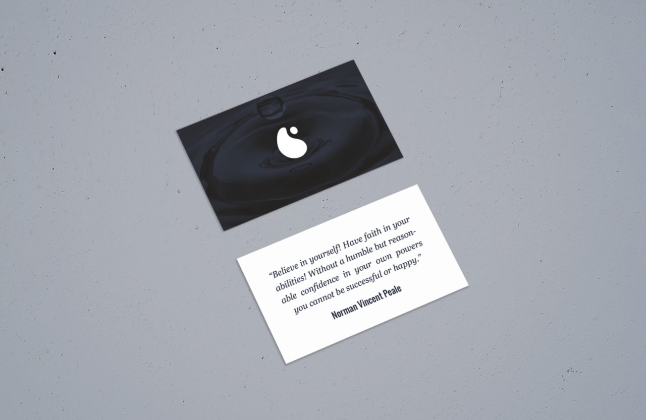
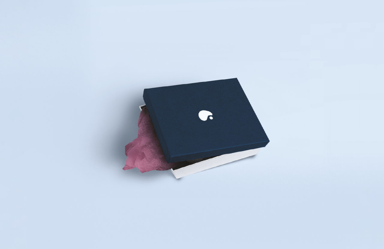
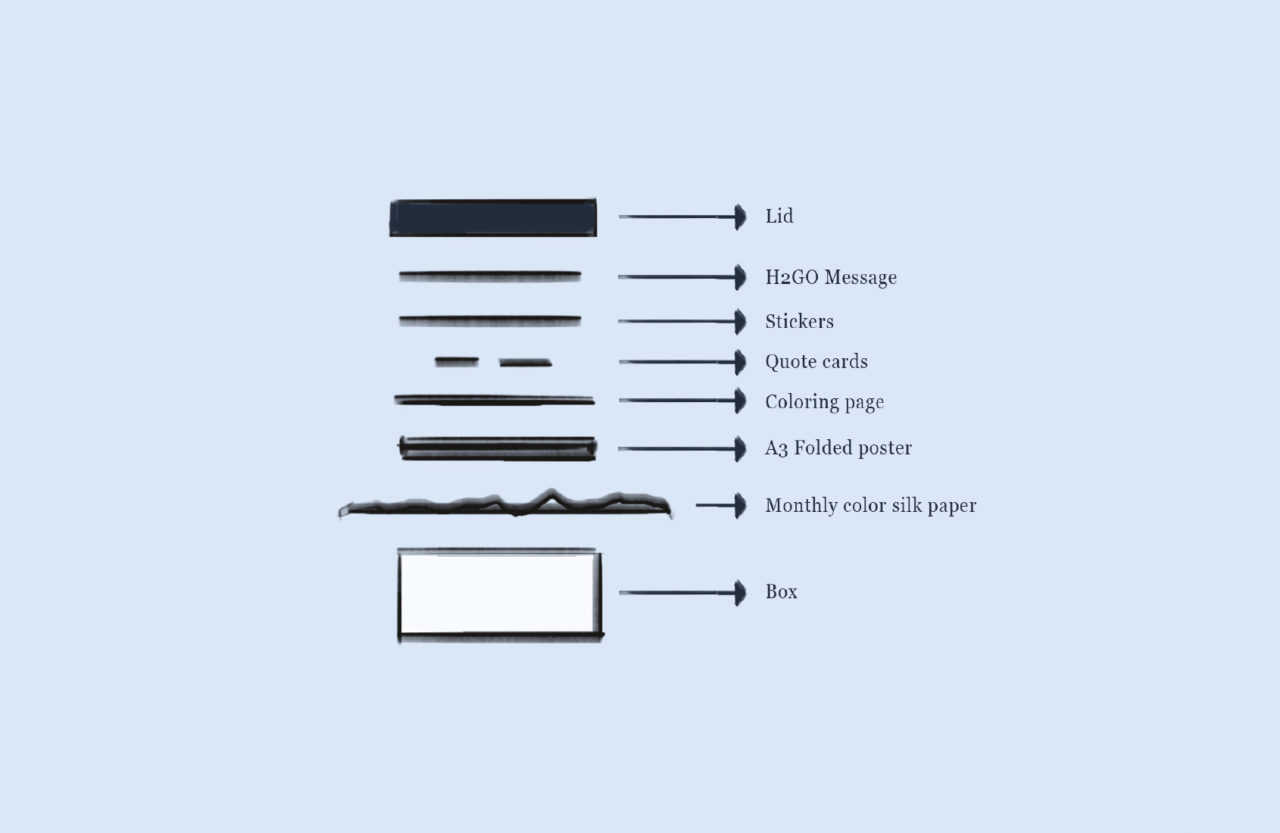
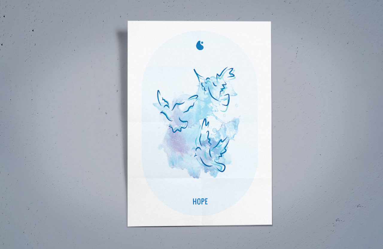
I have taken on the task of designing a complete brand and packaging experience for a niche market. The end product is a subscription-based service that sends out stickers, posters, illustrations, cards, and other goodies to energize water and jugs with positive energy.
The Logo
To communicate the brand’s message of positive energy overcoming negative energy, I chose to experiment with the Ying Yang symbol. My goal was to make the positive energy side significantly larger, suppressing the negative energy. After refining and balancing the logo, I achieved a fluid and cheerful abstract human pictogram that accurately represents the brand’s values. The final design is smooth and fluid, with clean edges reminiscent of water drops and negative space playing an important role in the overall design.


Challenges
One of the major challenges was to create a brand that would connect with the target audience in this niche market. I had to find a way to effectively communicate the brand’s values and messaging in an engaging and memorable way. Furthermore, creating a captivating packaging experience was critical to the success of the project, as it would shape the subscribers’ overall experience with the brand.
